Many fans of Star Trek: The Original Series are interested in the details of things that are seen in the episodes, and we, as collectors and curators of TOS film and photographs, often get asked if we could examine our material to get information for them. For example, we’ve been asked about the how effects were done, what the details of certain props look like, whether a particular stuntman was in a particular scene and so on. However, two important questions that we are asked fairly frequently are:
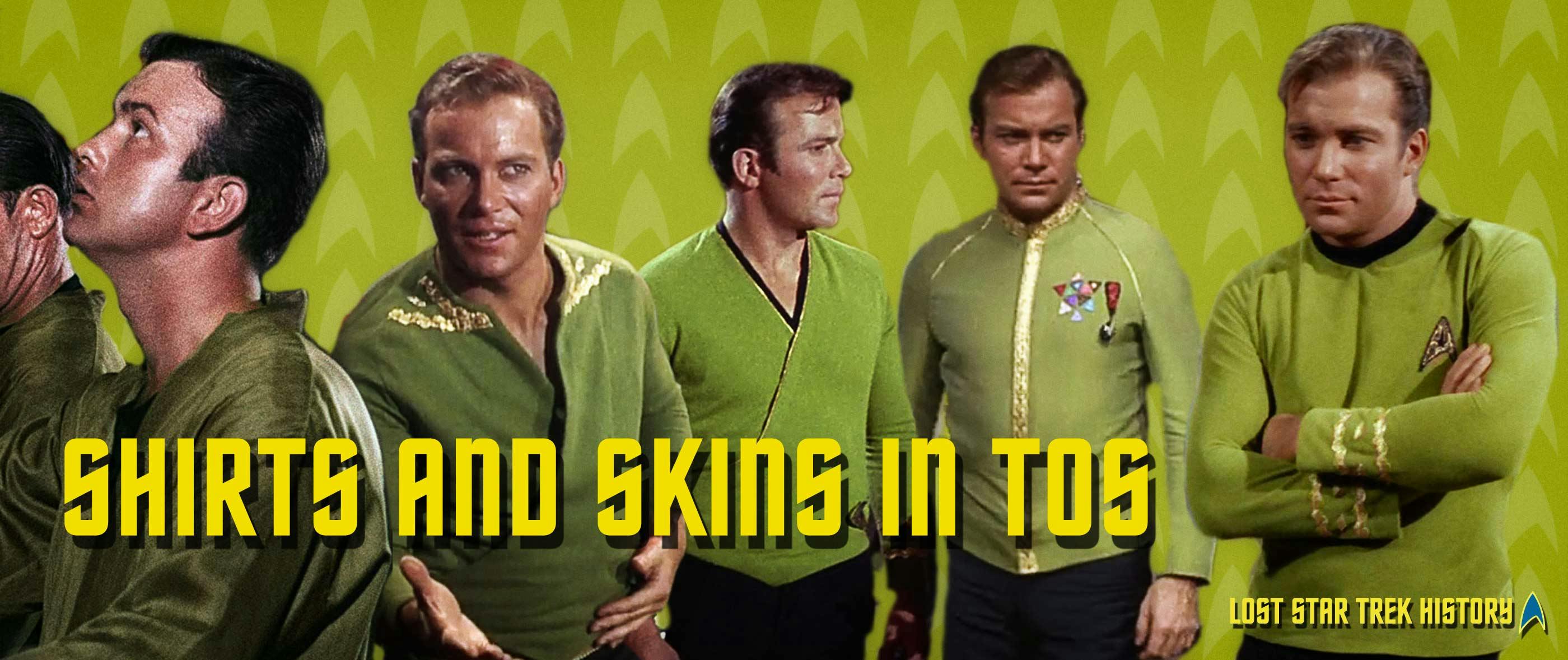
Why does Kirk’s command tunic sometimes appear gold and other times greenish?
Why does Mr. Spock’s skin color seem to vary from chicken-soup yellow to crab pink?
They’re good questions, and ones that we ourselves asked when we were learning about TOS. And since they do get asked often, we thought we’d address them here, at StarTrek.com. Interestingly, and as you’ll see, the answer to both questions is fundamentally the same, so please keep reading and you’ll see that the issues related to color in TOS are pretty… black and white.
Command Tunic Color
So, what color was Kirk’s command tunic? Was it gold, mustard, green or something else completely different? Well, the answer to that question can be found directly from the source. That is, based on fabric samples from costume designer William Theiss as well as interviews with him, we know it was actually a very subtle avocado green and not gold or mustard as it sometimes appeared in the episodes. Simply, Theiss wanted the three Starfleet service branches to be represented by the three primary colors. He selected red for engineering, blue for sciences and… wait for it… green for command. He was actually fairly consistent in his approach and even designed the work jumpsuits using this same scheme.
But, and to get to the changing command-tunic-color issue, if Theiss fabricated the command shirt from an avocado-colored fabric, why did it sometimes appear gold in the episodes?
As we mentioned previously, the answer to that question is the same as that for the question of why Mr. Spock’s Vulcan makeup sometimes appears pink. So, let’s address that issue next, and then we’ll get to the reasons for both.
Vulcan Skin Tones
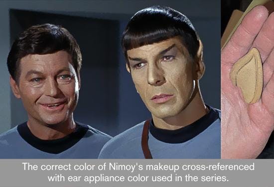
Most everyone who’s reading this article knows that makeup artist Fred Phillips spent a great deal of time determining what color Mr. Spock’s skin should be before settling on something that resembled yellow chicken soup (according to Robert Justman in Inside Star Trek: The Real Story). From a practical standpoint, he made the Vulcans this color because Gene Roddenberry wanted the race to look different from the humans. And to do that, in that era when the majority of households had black and white televisions and color sets were relatively new, Phillips settled on a yellow color. That color, after extensive testing, looked good on both color and black and white televisions (darker colors looked muddy on monochrome sets and lighter ones washed out).
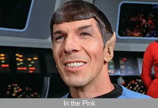
But… careful observers have noticed that sometimes Mr. Spock’s yellow tones look pink in the episodes, similar to those of the humans.
Why is that?
Well, as we said at the beginning of this article, the answer to both questions posed at the beginning – that is, why do the command tunics sometimes appear gold? and why does Mr. Spock’s skin vary from yellow to pink? – is the same. And there are five major reasons for these differences. Let’s briefly run through them, starting with those that influence the colors on the final broadcast print.
Eastman Kodak Film
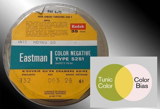
The first reason that the colors shifted has to do with the film used back in the 1960’s. TOS was shot on an Eastman Kodak negative film and the prints struck from it had a color gamut (that is, range) that favored a warmer palette. In fact, cinematographers have known for quite a while that the consumer and professional Kodak print films tend to have warm green colors that lean toward yellow. What this means, for example, is that colors that are a particular shade of green – such as the command tunics – would be shifted towards yellow in the print.
Color Temperature
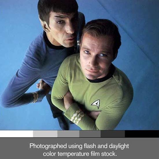
Another reason that the colors of the command shirts and Vulcan skin appear to be shifted on the film has to do with the type of lighting used on the set (basically indoor, or “tungsten,” lighting) and how different that is from “natural light.” As a real-life example of how these types of differences in lighting affect color, anyone who buys paint at a hardware store knows that the color of the paint in the store can look completely different than the color of it on your wall at home. This has to do with the lighting differences between the store and your home and gets at something called color temperature. Color temperature, basically, refers to color bias and, with regards to lighting, some lights are biased blue and are referred to as cold, while others are biased red and are referred to as warm. Camera flashes, some fluorescent lights (like in our hypothetical hardware store) and the sun are blue biased while old-school tungsten lights (like in some of our homes) are red biased.
With regards to the command tunic material, it looks unmistakably green under daylight or flash conditions but, under tungsten studio soundstage lighting, the warmer colored lights combined with the film print stock caused the particular green to look yellow/gold when viewed. Theiss must have been disappointed in how the tunics looked on television because he designed two wraparound versions for William Shatner that had deeper, different shades of green.
Color Timing
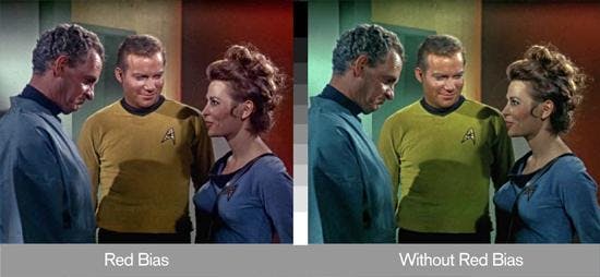
A third reason as to why the colors were different, which is also the reason that principally accounted for their variability from scene-to-scene and from episode-to-episode, had to do with color timing. Color timing, as that term implies, refers to changing or enhancing the color of an image in a motion picture, and it’s done by a person called a colorist. A colorist’s job involves matching the luminance and color values from scene to scene but, unfortunately, they can be inconsistent and biased. Sometimes, for example, a colorist opts for making people look as pleasing as possible, which implies a healthy, rosy, red-biased complexion. This desire often resulted in Captain Kirk and Dr. McCoy looking good, but it sometimes negated the correct make-up color for Mr. Spock. (As a Trek fan, you may have heard about the infamous Orion makeup test for the pilot episode, “The Cage,” where the green makeup looked pink because the color timer assumed the film had a green bias to it that he corrected for.)
Optical Effects
Another reason that the colors on the screen did not resemble their real-life colors, and the final one that we’ll look at with regards to the color shifts in the final print, has to do with whether or not the film was run through an optical printer (the device that was used to create the optical effects). Specifically, whenever an optical effect was present in a scene – e.g., a transporter effect, a dissolve to a different scene, etc. – there was generally a color shift in that scene in comparison to the preceding and/or proceeding scenes. This shift, which was accompanied by an increase in contrast and film grain, was a result of how the optical printer was used to create the effect and the fact that multiple, different pieces of film were often used. Additionally, since TOS used more than one company to create the optical effects, even for the same episode, different companies handled the film differently.
It probably goes without saying that, given the time and money, these discrepancies caused by the optical printing process could have been corrected. However, TOS had neither, and, unfortunately, leaving the color shifts in place added more weight to the misperception of what the colors truly were.
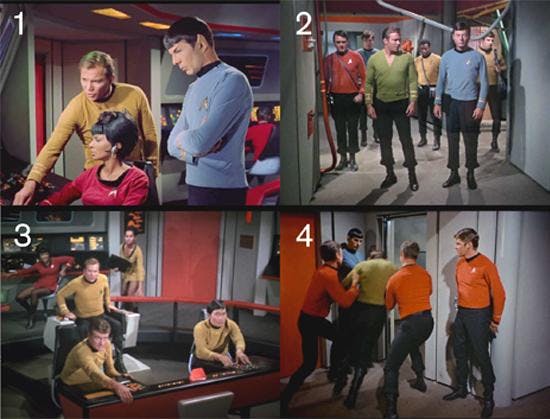
Below are examples of scenes that were created using an optical printer, and all of the photos in the collage were obtained from the re-mastered digital versions. Photo No.1 shows a screen capture of a typical dissolve transition, and note that the command shirt is yellow and Spock’s flesh tones have a magenta tinge. No.2 was captured just after a transporter effect and, again, the command tunics are yellow and the flesh tones have shifted to magenta. No.3 was obtained from an optical effect to simulate the ship shaking and, again, yellow tunics and magenta tinted flesh tones. No.4 is a scene transition where the image squeezes together and then widens out. The red tunics in this short sequence have a color shift, this time to orange.
The Eyes Have It
Up to this point, we’ve been discussing the factors that influenced the colors in the final broadcast prints of the episodes. However, recording the images on the film was only about half the process of getting TOS into your home. The other half, of course, was transferring the images on the film to your eyes, and these steps involved scanning the film, digitally encoding it (or broadcasting it as was done in the old days), and then displaying the result on your television. Needless to say, all of these variables can shift the actual color of the images that you see, and they generally do, since they each have a more limited gamut than either your eyes or the film.
And with that, we’re finished. We hope you were able to find some nuggets of gold – or avocado green, in this poorly timed pun – in our discussion of color shifts in TOS. Until next time.
David Tilotta is a professor at North Carolina State University in Raleigh, NC and works in the areas of chemistry and sustainable materials technology. You can email David at david.tilotta@frontier.com. Curt McAloney is an accomplished graphic artist with extensive experience in multimedia, Internet and print design. He resides in a suburb of the Twin Cities in Minnesota, and can be contacted at curt@curtsmedia.com. Together, Curt and David work on startrekhistory.com. Their Star Trek work has appeared in the Star Trek Magazine and Star Trek: The Original Series 365 by Paula M. Block with Terry J. Edrmann.


